In a list of art and fashion collaborations there is a bit of blurring that happens. There are moments when designers becomes artists, artists become designers, or both entities becomes something different entirely. Both the genre of fine arts and fashion design not only bare the affect of trend and social temperature, but their changing relationship to one another is also reflective of society as a whole. Perhaps some interventions and collaborations are more successful than others, but what is primarily important is the dabbling, the mixing, and fantastic results that come from the fanciful play of the privileged creatives.
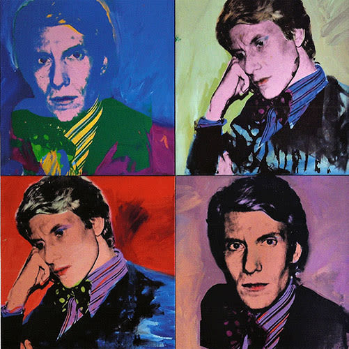
50. Yves Saint Laurent x Andy Warhol
50. Andy Warhol
Label: Yves Saint LaurentYear: 1974
The ongoing trend seems to be that fashion appropriates art. Most recently, fashion labels have become the patrons of major artworks like Francesco Vezzoli's 24 Hour Museum or the Prada Transformer Building in Seoul, South Korea. As often as contemporary fashion houses patronize work, they also appropriate it; Marni's use of Rop van Mierlo and Brian Rea are easy examples.
However, in the particular case of Yves Saint Laurent and Andy Warhol (two men who need no introduction), Saint Laurent is the subject, and the product is a silkscreen image of a youthful Yves by Warhol himself. The 1974 work is done in a style similar to Warhol's other works-an even square divided into four equal quadrants. The portraits are paired diagonally, but the paired images are painted in decidedly different and fanciful ways. The painting stands today as a commemorative gesture to the great fashion designer. Although the painting itself is not a garment or accessory per se, the object stands a reflection of the intimate ties between the culture of fashion and art.

49. Vanessa Beecroft x Helmut Lang (for Vanessa Beecroft's 2002 VB45)
49. Vanessa Beecroft
Label: Helmut LangYear: 2002
Artist Vanessa Beecroft's 2002 work, VB45, is her largest to date, but it still takes on a similar format to her older works. The women of Beecroft's VB45 work at Jeffrey Deitch's New York City gallery, Patrick Painter, in video and photographic forms. A fleet of supermodel-like women stand starkly in the nude (save for thigh high leather boots), designed specially by Helmut Lang. The performance consists of the women continuing to stand until each individual becomes tired of standing and chooses to sit. VB45 comes to a conclusion when the last woman concedes to sitting.
The entire interaction between audience and subject is an artistic excuse for voyeurism, and Lang's boots not only add to that sentiment, but provide the perfect costume for Beecroft's statuesque participants to become characters that lie somewhere between objectified fetish and a controlling dominatrix. The large grouping accompanied by Lang's eroticizing costumes only add to the work as a "minimalist, military type formation," originally created for the Kunsthalle Wien in February of 2001.
48. Triumph in the Face of Absurdity - Charming Baker and Paul Smith
48. Charming Baker
Label: Paul SmithYear: 2012
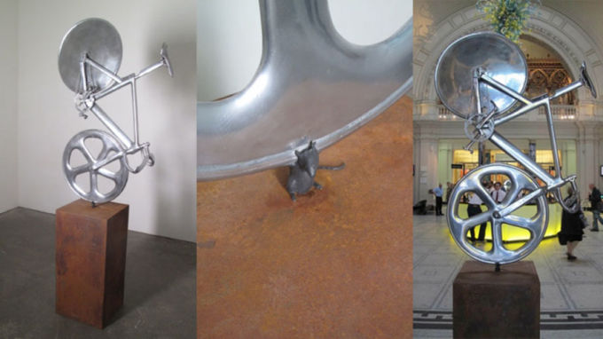
British designer, Sir Paul Smith, and UK artist, Charming Baker, collaborated to make a sculpture that is sweetly optimistic and inspired. The polished cast aluminum on a corten steel plinth is titled Triumph in the Face of Absurdity. The sculpture is "about life and about how humble your start is in any way. It's not linked with money or finance, it's to do with the fact that if you try hard and dig deep, however small you start, you can do great things...Effort is free of charge!" The aluminum cast bicycle is based on the one ridden by British gold medalist, Sir Christ Hoy, and had a timely connection to the arrival of the summer Olympics in London that year. The most saccharine detail of the sculpture lies in the small space between the bicycle and the plinth: a little life-size mouse. From afar it is hard to tell, but upon closer investigation it's clear that this tiny mouse is holding up this momentous bike—a feat for any mouse, but especially for the collaborative sculptors.
47. Yves Saint Laurent x Piet Mondrian
47. Piet Mondrian
Label: Yves Saint LaurentYear: 1965
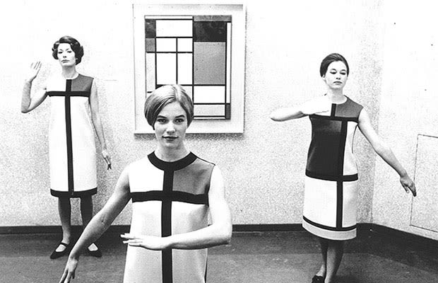
No art and fashion collaboration list would be complete without the classic and iconic Yves Saint Laurent dress inspired by artist Piet Mondrian. Saint Laurent released the 1965 dress for the Autumn season; its simple A-line, and tidy shift silhouette was typical of the mid-sixties. What was perhaps less typical was the clear allusion Saint Laurent was making to Mondrian in his uses of graphic black lines (running both horizontally and vertically) and white and primary color blocks. Its seamlessness is deceiving—the dress is made up of many of individual pieces of wool jersey and was hand-assembled to hide obvious seaming. This dress is not only an icon for Western fashion but also records the importance of Mondrian's work during the period of the 1960s.
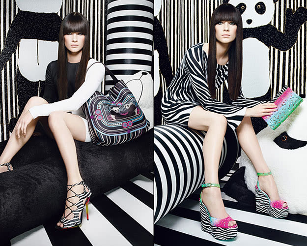
46. Jimmy Choo x Rob Pruitt
46. Rob Pruitt
Label: Jimmy ChooYear: 2012
In 2012, internationally renowned footwear designer, Jimmy Choo, collaborated with contemporary artist, Rob Pruitt, to create a capsule collection. Pruitt is maybe best known for his seven-foot Soho Andy Warhol Monument commissioned by the Public Art Fund. The artist-footwear designer team concocted a number of shoes, purses, scarves, and other accessories. Pruitt and Choo's designs were all limited to the collaboration and featured motifs like glittery zebras, cartoon pandas, and crystals using over 11,000 hand-applied crystals. The duo created graphic interplays between lace and snakeskin including graphic motifs of sprinkles and zebra stripes.
The energetic and bold collection includes the Cayla clutch, which has sprinkles on an ombré backdrop with a zebra pavè flap and a playful panda lining. Daring zebra-print lace up stilettos with swirls of fiery reds, oranges, and yellows trailing up the heels and soles also found their way into the lineup. Pruitt said in an interview with Lili Rosboch of New York's Bloomberg News, "I think that my art really comes alive when it's activated in these kinds of ways. I would feel terribly sad if it only hand an existence on the wall of galleries, and hopefully, museums."
45. Rolf Sachs x DeBeers
45. Rolf Sachs
Label: DeBeersYear: 2012
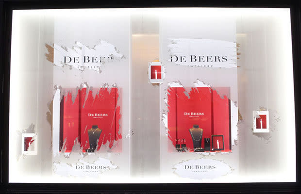
Rolf Sachs is a Swiss-born multi-disciplinary artist, with a practice that ranges from set design and furniture-making to ballet and photography. DeBeers is a family of companies that is considered to be the dominant force of diamond sales around the world. The DeBeers company approached Sachs for a commission to dress their windows for the 2012 Holiday season. Sachs graciously accepted, excited at the chance to investigate light in its primal, more organic form—the flame. He says, "The candle is an everyday object, yet its light has soul and radiates warmth."
The installation, titled Breathing Light, emanates a warm glow from the red display. The window's shimmering translucence recalled frost-veiled panes amid a snowy winter. Small sections were swiped clear, as if by a curious passerby, only to reveal flickering candles on the face of a glowing iPad. Sachs contrasts and conflates highly primitive light sources—like the flame—and innovative technological light sources—like the iPad. Despite the wholly inaccessible jewel-encrusted merchandise inside the vitrines, the window feels warm, alluring, and nostalgic.
44. Fabrizio Plessi's Molten Bag for Louis Vuitton
44. Fabrizio Plessi
Label: Louis VuittonYear: 2008
In April 2008, Louis Vuitton opened up their newest and largest flagship store in Hong Kong. The luxury giant then invited Italian artist, Fabrizio Plessi, to partake in the design of the boutique's interior. Plessi, a pioneer in video art in Europe, was no stranger to high stakes collaborations; his work is held in esteemed collections around the world, and Plessi is well acquainted with the complicated circumstances that go into the creation of a site-specific installation work (like his monumental 2001 video sculpture installed on three sides of San Marco Square, entitled Waterfire, used to inaugurate the Venice Biennale that year).
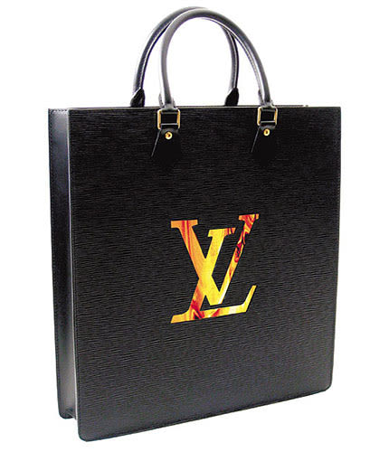
The collaboration paid off in the form of huge LED screens that featured molten gold cascading down golden walls and other fixtures at the Hong Kong boutique. Vuitton also invited Plessi to create a bag of his own design. Fabrizio Plessi then conjured the Molten bag, a tote made of black EPI leather, with an incised LV logo that reveals an ultra-flat TFT LCD screen showing the images of the same seductive, molten gold of the Hong Kong boutique's LED screens. Plessi's purse is limited to an edition of 88 and retails for $50,000.
43. K8 Hardy x Oscar Tuazon at the 2012 Whitney Biennial
43. Oscar Tuazon
Label: K8 HardyYear: 2012
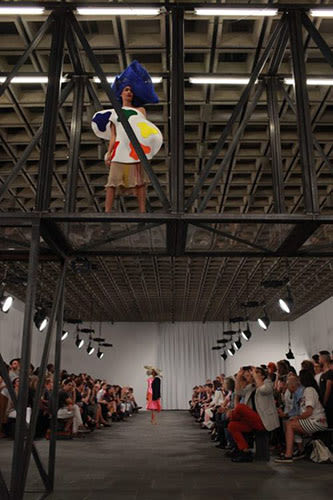
Artist K8 Hardy's Untitled Runway Show, 2012 continued in the spirit of lukewarm crossover projects. The gesture appeared genuine; in a New York Times interview Hardy said, "I want people to think of the entire runway show as a work of art. It's...to interrupt its normal and largely unquestioned flow." On the day of the show, models descended the runway-cum-sculpture by fellow Whitney Biennial artist Oscar Tuazon.
Tuazon's work frequently features the forms of the function—stairs, walkways, and wall partitions—in an arrangement of dysfunction. However, in the case of Untitled Runway Show, Tuazon's style shone through in his bare-bone use of industrial materials, permeable boundaries, and rigid geometric modulation. And the procession of Hardy's runway choreography challenged the repetitious conventions of New York Fashion Week's innumerable shows; models walked backwards and sideways, and some at especially painful, slow paces. Hardy openly admits that the clothes were not the primary purpose of the collaborative effort, and it shows. The garments looked more like cheap costumes, some modeled after painting palettes, and others were made of multicolored bras.
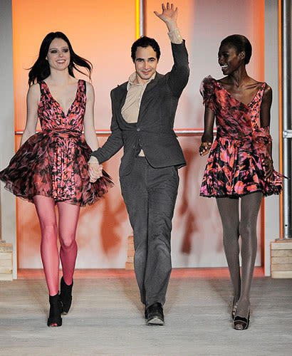
42. Zac Posen x Rosson Crow
42. Rosson Crow
Label: Zac PosenYear: 2010
Enigmatic American painter, Rosson Crow, who's represented by gallery Honor Fraser, found some initial notoriety from her art-world "bad boy" friends: Dan Colen and Dash Snow of the downtown New York and Los Angeles art scenes. But in more recent days, Crow has been forging relations with members of the New York fashion circuit.
"I got a call [in 2009] from a stylist friend, a boy I hadn't talked to in years," Crow said in an interview. "He said, 'My boyfriend wants to work with you.' I said, 'Who are you dating now?" And he said, 'Zac Posen.' I went, 'Oh my God. I'd love to!" And sometimes, apparently, it is just as easy as saying "yes." Crow's agreement to work with Posen resulted in her paintings as textiles for Posen's 2010 Autumn/Winter collection.
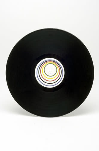
41. 4 Mile Minute - Hussein Chalayan x Gavin Turk
41. Gavin Turk
Label: Hussein ChalayanYear: 2012
It began when prestigious fashion designer, Hussein Chalayan, interviewed British artist, Gavin Turk, about "his enduring preoccupation with the mythical status and identity of the Artist." The subsequent musical collaboration—inspired from the transcript of their first meeting—resulted not only in an audio track, but a video accompaniment made from the perspective of a needle traveling along the surface of a vinyl record, created by Turk. The work was created as a part of "Britain Creates 2012," a nationwide effort between visual art and fashion design. The duo was inspired by artists, Marcel Duchamp and Roger Bannister, and limited the production of the vinyl to 100 copies, hand signed by both artists. Unfortunately, the unique "copper master" was created to self-destruct after a full play on the turntable—the only way to access it in the precious conversation between two artistic icons of this generation is to destroy it.
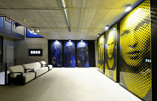
40. Karl Lagerfeld at St. Mortiz's Galerie Gmurzynska "Fire Etchings"
40. Karl Lagerfeld
Label: Karl LagerfeldYear: 2013
Beginning on February 19, 2013, designer extraordinaire, Karl Lagerfeld, will be exhibiting his latest body of work, "Fire Etchings." The press release reads, in a "new body of artwork by one of the greatest renaissance personalities of our time...work created from backlit glass has had its image etched into the surface by fire." These slick monumental portraits of Lagerfeld's muses (rapper, Theophilus London, and models, Freja Beha Erichsen and Aymeline Valade) are framed as Lagerfeld's confident response to contemporary portraiture. In this particular collaboration, Fashion-Lagerfeld is working with Art-Lagerfeld in order to form something of a Meta-Lagerfeld that knows no boundaries between life and art, because all of it is within his reach. Lagerfeld's Fire Etchings will be on display at St. Moritz's Galerie Gmurzynska until March 23, 2012.
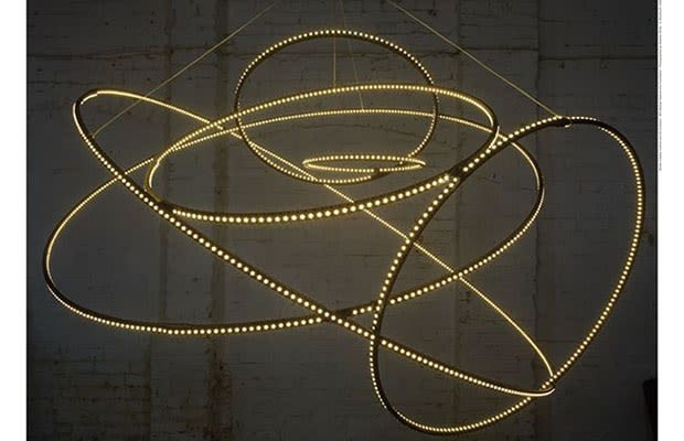
39. Celestial Bonnet - Stephen Jones and Cerith Wyn Evans
39. Cerith Wyn Evans
Label: Stephen JonesYear: 2012
Stephen Jones is a respected and highly skilled British milliner, and Cerith Wyn Evans is a Welsh multimedia artist, whose work ranges from film and sculpture to more conceptual pieces.
These two fiercely talented men were brought together by the 2012 collaborative effort by the Victoria and Albert Museum, titled "Britain Creates." Jones' background is in millinery work, but what he creates is far more than just "a hat." His work is sculptural and has a whimsical sense of dynamism—brims and swooping translucent crescents defy gravity effortlessly. Evans' artwork finds itself similarly suspended and controlled; his 2009 neon sculpture I=N=V=O=C=A=T=I=O=N looks like the predecessor to Jones' and Evans' collaborative work, Celestial Bonnet. But Celestial seems to have a more amicable quality than Evans' earlier work. The soothing warm LED bulbs that encircle the center make this bonnet akin to a multi-dimensional halo (especially when a woman like Florence Welsh is seen singing in it).
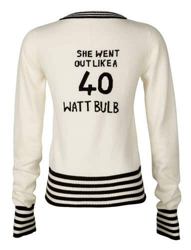
38. Banjo and Matilda x Tracy Emin
38. Tracey Emin
Label: Banjo & MatildeYear: 2011
Head designer, Bleynda Macpherson, of the Bondi-based cashmere clothing line, Banjo & Matilde, tapped British Turner Prize nominee, Tracey Emin, for the brand's annual charity sweater project. Emin's past work has dealt extensively with sewing, embroidery, and other traditional craft and textile work, so the pairing seemed quite fitting. Emin's 2002 work, Something I've Always Been Afraid Of, the blanket, I Do Not Expect, and her 2004 appliqué blanket, It's the Way We Think, inspired three cashmere pullovers all available for purchase by the public for a nominal fee of $399. Each cardigan sold contributed to a $100 donation heading to the Terrence Higgins Trust to raise awareness for HIV/AIDS. The black and ivory cashmere cardigans look quite comfortable, and are certainly less expensive, less risqué, and more philanthropic than Emin's usual artwork.
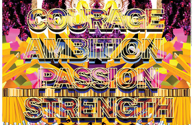
37. Tint the pallid landscape (off to the wars in lace) - Mary Katranzou x Mark Titchner
37. Mark Titchner
Label: Mary KantrantzouYear: 2012
As a part of the "Britain Creates 2012" fashion and art collaboration, fashion designer, Mary Katrantzou, and artist, Mark Titchner, created a seven-minute digital video animation and a two part lenticular print. Katrantzou is best known in the fashion world for her sumptuous and highly detailed digital prints; her clothes become more like wearable hi-res digital collages, with images ranging from picket fences and Ticonderoga pencils to florals and decorative friezes.
Titchner's text-based work won him the prestigious Turner Prize in 2006, and his commitment to residencies in places like Toronto gave him the opportunity to emblazon billboards with his graphically aggressive phrases like "BE REAL" and "WE WANT TO ADMIT OUR MISTAKES." The collaboration blossomed into a playful and densely layered world of digital imagery. The skills of computer animators allowed the two graphic worlds of Katrantzou and Titchner to fuse into one. Dizzying, almost psychedelic patterns undulate behind a slow-moving script as words like "STAMINA," "STRENGTH," and "AGILITY" float across the screen. Although the digital video is almost painful to sit through, the experience between the lenticular print and the video must have proved for a very trippy afternoon of art.
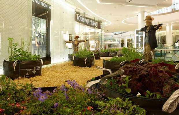
36. Jeremy Deller for Louis Vuitton London
36. Jeremy Deller
Label: Louis VuittonYear: 2009
2004 Turner Prize-winning artist, Jeremy Deller, works a bit differently than most artists of his generation. Deller is known for filling institutions like the Tate Britain with bouquets, organizing countryside concerts, and from February to May of 2012, Hayward Gallery in London mounted a retrospective of his work entitled "Joy in People." One could say that Deller's artistic practice is a social practice, and in the case of his collaboration with Louis Vuitton, that label could easily apply. Deller was commissioned by the French luxury label to create an original installation of a garden for the opening of their boutique in London's Shepherds Bush. Deller said the piece was "designed as a contemporary symbol of sustainability and natural energy," a sentiment which is uncannily similar to the feelings of Ebenezer Howard and the Garden City. Regardless, the art piece was later donated to the Hammersmith Community Gardens Project. In an interview Deller commented on "London's love for a good garden,' but there must be a sort of innocent excitement at seeing plots of dirt, hay, flowers, herbs and Louis Vuitton merchandise all under the watchful eye of a scarecrow. Deller installation remained in the boutique space from May 19 to May 26, 2009.
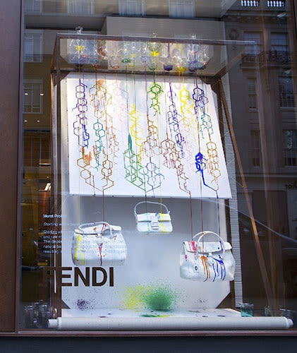
35. RCA Installations at Fendi: Meret Probst's window installation
35. Meret Probst
Label: FendiYear: 2011
The students of Britain's Royal College of Art were offered the opportunity to create installations in the recently opened Sloane Street Fendi boutique. The young artists were encouraged to incorporate surplus materials (like dye, and off cuts of leather) for their installations. Fendi's openness to the students paid off; particularly in the case of Meret Probst's Starting with a Blank Canvas that resided in the front window the Fendi shop was inspired by the colored leather goods of the legendary label. Probst's display begins in stark white canvas, with Fendi purses hanging from the bottom. Then, slowly, a stream of dye is released into a winding polygonal tour down the canvas and subsequently drips onto the canvas, the bags and the display, and transforms this peculiar intervention into a 'decorative and ever-changing picture.'
via
34. Retna, Aiko, and Os Gemeos x Louis Vuitton
34. Retna, Aiko, and Os Gemeos
Label: Louis VuittonYear: 2013
Louis Vuitton is both wonderful and awful because the fashion house knows no bounds. The luxury brand has dabbled into the world of fine arts, and now with Street Art's ascension into to acceptance in the 'high art world' (think MOCA Los Angeles' "Art in the Streets," and innumerable documentaries) a collaboration with the legendary brand was imminent. Then came the exciting but mostly uninformative short film from Vuitton announcing its collaboration with "three luminaries from the world of street art" to, as Tokyo-born, Aiko says in the clip, "break the tradition with wild style." Vuitton also invited Brasilian twin-brother-team Os Gemeos, and Los Angeles-based graffiti artist Retna to design a piece for the collection. In addition to the cashmere and silk stole designed by Retna, he, and another artist by the name of Hox, were commissioned to paint the façade of the Miami storefront – a North American first for Louis Vuitton.
via
33. Fendi x Trevi Fountain
33. Trevi Fountain, Rome, Italy
Label: FendiYear: 2013 - 2014
Admittedly, this pairing is not such a clear relationship as others on the list, but culturally, it is incontrovertible that this collaboration deserves a spot on the list. Italian luxury fashion label Fendi is the latest to foot the bill for the restoration of Rome's famed Trevi Fountain. The treasured fountain passed its 250th anniversary last year, but because of consistently poor management due to lack of funding, the façade has fallen into disrepair. Creative head of Fendi, Karl Lagerfeld, made a public statement promising €2.18 million (US$2.93 million) to the restoration of the Trevi Fountain. Fendi follows the 2012 announcement from Tod's (also an Italian fashion house) promise to finance the restoration efforts to Rome's monumental Coliseum. Fendi's CEO said the "deal was about reinforcing the brand's historic links with Rome, where it started as a modest handbag and fur shop and 'giving back to the city that has hosted us since 1925.'
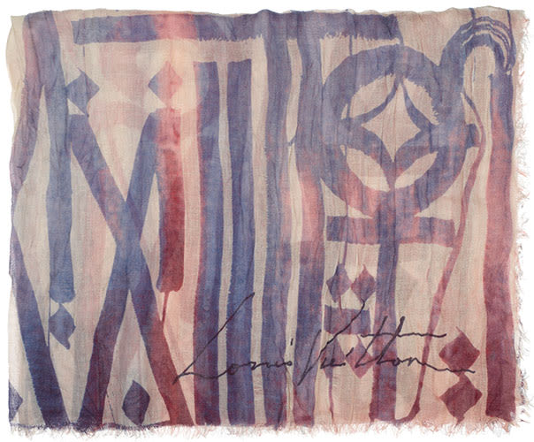
34. Retna, Aiko, and Os Gemeos x Louis Vuitton
34. Retna, Aiko, and Os Gemeos
Label: Louis VuittonYear: 2013
Louis Vuitton is both wonderful and awful because the fashion house knows no bounds. The luxury brand has dabbled into the world of fine arts, and now with Street Art's ascension into to acceptance in the 'high art world' (think MOCA Los Angeles' "Art in the Streets," and innumerable documentaries) a collaboration with the legendary brand was imminent. Then came the exciting but mostly uninformative short film from Vuitton announcing its collaboration with "three luminaries from the world of street art" to, as Tokyo-born, Aiko says in the clip, "break the tradition with wild style." Vuitton also invited Brasilian twin-brother-team Os Gemeos, and Los Angeles-based graffiti artist Retna to design a piece for the collection. In addition to the cashmere and silk stole designed by Retna, he, and another artist by the name of Hox, were commissioned to paint the façade of the Miami storefront – a North American first for Louis Vuitton.
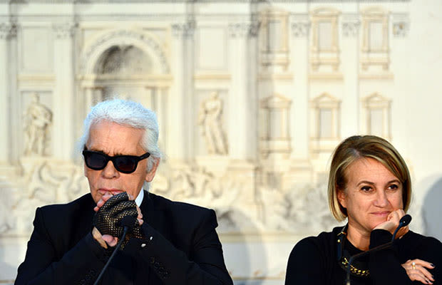
33. Fendi x Trevi Fountain
33. Trevi Fountain, Rome, Italy
Label: FendiYear: 2013 - 2014
Admittedly, this pairing is not such a clear relationship as others on the list, but culturally, it is incontrovertible that this collaboration deserves a spot on the list. Italian luxury fashion label Fendi is the latest to foot the bill for the restoration of Rome's famed Trevi Fountain. The treasured fountain passed its 250th anniversary last year, but because of consistently poor management due to lack of funding, the façade has fallen into disrepair. Creative head of Fendi, Karl Lagerfeld, made a public statement promising €2.18 million (US$2.93 million) to the restoration of the Trevi Fountain. Fendi follows the 2012 announcement from Tod's (also an Italian fashion house) promise to finance the restoration efforts to Rome's monumental Coliseum. Fendi's CEO said the "deal was about reinforcing the brand's historic links with Rome, where it started as a modest handbag and fur shop and 'giving back to the city that has hosted us since 1925.'
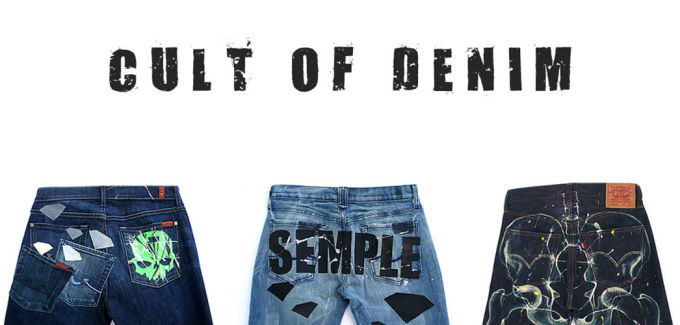
32. Stuart Semple, Cult of Denim, 2008
32. Stuart Semple
Label: 7 For All Mankind, Diesel, JBrand, Levi's and othersYear: 2008
28-year old British artist Stuart Semple teamed up with Selfridge's department store in London, as well as several popular denim labels including, 7 For All Mankind, Diesel, JBrand and Levi's among others. For the in-house exhibition, Semple produced a series of limited-edition paintings and an installation that reflected on Britain's unwavering affection for denim, as well denim's continuing role in shaping popular culture. Semple was given access to the archives of each brand to imbue each work with the history of the respective brands. Semple was also invited to design a small line of original merchandise of printed denim, graphic tees and eight pairs of hand-painted jeans to retail during his residency at Selfridge's; each one with a 20% proceed going to Refuge, a campaign to stop domestic violence. And although Semple's exhibition is about fashion and mass appeal, Stuart is clear "that it's about art, and not an exercise in brand PR." Semple's Cult of Denim remained at Selfridge's from October 17 to November 15, 2008.
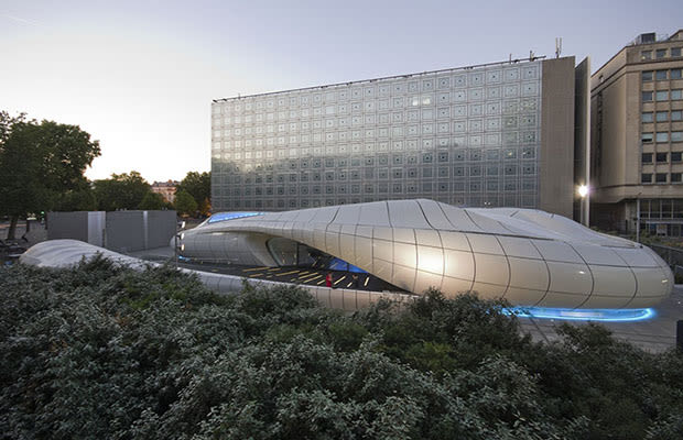
31. Zaha Hadid x Chanel
31. Zaha Hadid
Label: ChanelYear: 2008
The London-based architect, Zaha Hadid, designed the mobile Chanel Pavilion gallery that spent the bulk of 2008 traveling the world. It began its journey in Hong Kong in February, and then spent time in Tokyo until the end of July. After the Pavilion's close in Japan, it arrived in New York City's Central Park—and to much criticism. Amidst the grip of the recession, Chanel paid a fee of $400,000 to rent the space in the park and the additional donation to the Central Park Conservancy felt frivolous. And according to New York Times' Nicolai Ouroussoff the whole thing is a "black hole of bad art and superficial temptations." But criticism aside, Hadid's homage to Chanel's iconic quilted purse finds the graceful shape of the nautilus-like form that coils around a central courtyard. Despite the exhibition featuring internationally renowned artists such as Sophie Calle, Nobuyoshi Araki, Daniel Buren and Subodh Gupta, the structure holding the artwork steals the show with its seamless beauty. The hundreds of fiberglass panels and steel skeleton pieces were designed build the structure in less than a week; a turnover time that gives Fashion a run for its money.
30. Isaora Artist Series
30. Rostarr, Kenzo Minami, Hisham Akira Bharoocha and others
Label: IsaoraYear: 2012
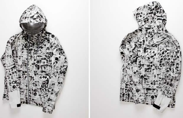
New York-based clothing brand, Isaora, is a self-proclaimed "forward-thinking brand," that is engineering clothes to protect the wearer from the harshest elements. Their clothes are simultaneously functional and fashionable—even in times of poor weather—when being fashionable can be a low priority. In perfect step with their philosophy, Isaora has worked to hold an auction to benefit Waves 4 Water—a foundation that provides assistance to those affected by 2012's Hurricane Sandy. Isaora distributed one of their riding shell to 13 artists, and requested that each customize the jacket to their liking. Artists such as Rostarr, KATSU, Craig Redman, Kenzo Minami, Hisham Akira Bharoocha and others each created an original winter jacket that was set to be auctioned online. And, in an uncommon (but certainly appreciated) gesture, 100% of the proceeds to go to Waves 4 Water. After all, there are few better things than looking good and doing good at the same time.
29. James Nares x Coach
29. James Nares
Label: CoachYear: 2012
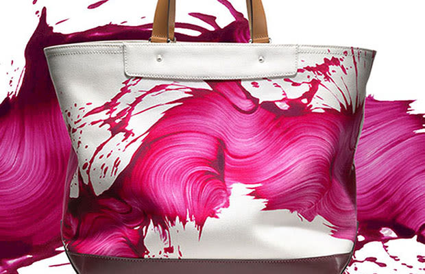
Although Louis Vuitton may have pioneered the painted monogram in collaboration with artists like Stephen Sprouse, Coach has taken painted purses in a different direction. They approached New York-based abstract painter, James Nares, to collaborate in creating a line of tote bags to debut in late April of 2012. Nares' signature style of wide, swirling, spontaneous strokes were translated into a series of six totes bags, each in limited to editions of 175 in each color: bright pink, persimmon orange, deep navy blue, cadmium red and vivid green streaks on a white canvas ground, and a series of a pearlescent-metallic paint stroke across a black ground. One of these Nares x Coach totes will retail at about $800, which is by no means the cost of a typical canvas tote bag, but is far less expensive than the large-scale painted canvases Nares is used to selling.
28. Matt Groening x Comme des Garcons
28. Matt Groening
Label: Comme des GarconsYear: 2011
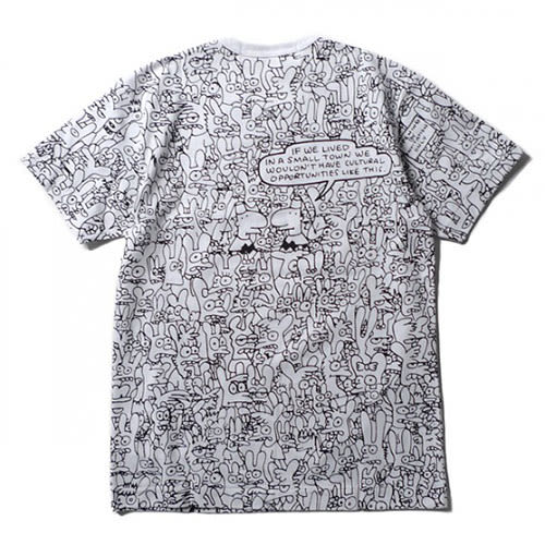
Creative director of Comme des Garcons, Rei Kawakubo, is known for her unexpected decisions and impeccably unpredictable style. However this 2011 collaboration with famed animator, Matt Groening (of the Simpsons and Futurama) and a slightly more obscure project Life in Hell, came as a large surprise to just about everyone. Kawakubo's business partner and husband, Adrian Joffe, told Style.com that after he had discovered Life in Hell, "I told Rei about it, because [as a fashion designer] your life is hell; to do a new collection every six months is hell." The collaboration at a glance does not take on as disenchanted a tone as the comic, but even if it did wouldn't you still wear it?
27. Keith Haring Foundation x Tommy Hilfiger
27. Keith Haring
Label: Tommy HilfigerYear: 2010
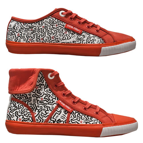
Tommy Hilfiger created a limited-edition footwear collection in collaboration with the Keith Haring Foundation, not only in a gesture of creative expression, but also of philanthropy. The infamous Haring was well known for his animated and figurative line drawings, his social and political activism, as well as other legendary gestures like the "CRACK IS WACK" mural on 128th Street and 2nd Avenue in New York City—a response inspired by the crack epidemic of mid-1980s New York. The artist was diagnosed with AIDS in 1988, and established the Keith Haring Foundation the year following his diagnosis to provide "funding and imagery to AIDS organizations." Haring's fashion counterpart in this collaboration, Tommy Hilfiger, founded the Tommy Hilfiger Corporate Foundation in 1995 to help to empower America's youth. The collaborative collection with Hilfiger is being sold at Colette in Paris – one of the most reputably styled boutiques in the world! Keith Haring has also found his way to musical artist Beyonce and Lil Wayne, to fashion labels like Levi Jeans, Joy Rich, Nicholas Kirkwood, Reebok, Zara Urban Outfitters, and even Kanye West's haircut. Haring's work has always done the work of blurring the boundary between the visual arts, and even 23 years after his death, his work is continuing to disseminate across the globe and become more a part of our visual vocabulary.
26. Levi Jeans x Damien Hirst x the Andy Warhol Foundation
26. Damien Hirst
Label: Levi's JeansYear: 2008
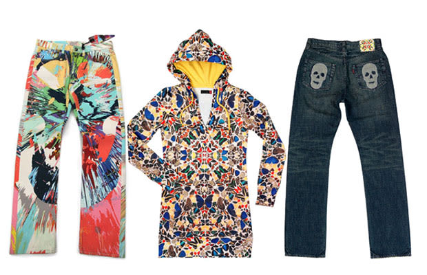
Notorious British artist, Damien Hirst, is perhaps most recognizable as the author of the Gagosian dot paintings, or the man who suspends sharks and bisected calves in formaldehyde tanks, or the artist of the obnoxiously expensive diamond and platinum skull. The launch of the collaboration between Hirst, Levi Jeans and the Andy Warhol Foundation debuted in the bare 'gallery atmosphere' of Levi's Berlin flagship store. The garments themselves are bold and wild, and defy logical categorization or commonality, save for their author—Mr. Hirst. Denim pants and jackets look like they have been run through a hyperactive spin-paint machine, kaleidoscopic reflections of butterflies make for a dizzying and hypnotic patterns, and blue jean pockets encrusted with crystals skulls are nostalgic of Hirst's 2007 piece For the Love of God. The exclusive line was sold at retailers like Barneys, New York, Union, and Fred Segal and American Rag in Los Angeles. As for the "collaborative" effort—Levi's just seems to have provided Hirst with a blank canvas and access to a broader commercial reach.
25. Marni x Rop van Mierlo
25. Rop van Mierlo
Label: MarniYear: 2013
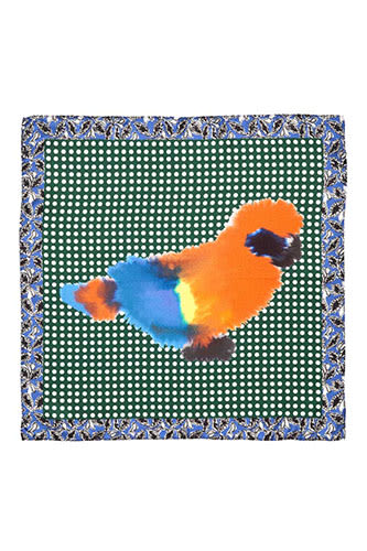
Italian-based brand, Marni, continues its playful collaborations with artist and illustrators from around the globe. Perhaps one of the most successful choices has been with Dutch artist, Rop van Mierlo. Mierlo, based out of Amsterdam, is best known for his recently published children's book Wild Animals, which won the Best Dutch Design Award in 2011. The book features pages of blotchy, watery-diffused animals: a snake, a rabbit, a lion, a pig, and a squirrel to name a few. He describes his process as interested in "creating animals he could not control"—how romantic. Though the entirety of Mierlo's aqueous menagerie is not featured in Marni's collection—released in mid-January of 2013—his donkey, parrot, ostrich and tiger don the tops, purses, and scarves of many of the most popular looks. In a recent interview with SSENSE Mierlo was asked, "Your animals seem soft, gentle and sweet. In the world of the wild animals you paint, would a tiger ever eat a pig? Would a dog ever bite an ear?" In response he said, "I sure hope so. Otherwise the pig bites the tiger in the rear."
24. Rodarte x Darren Aronofsky
24. Darren Aronofsky
Label: RodarteYear: 2010
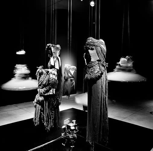
During Darren Aronofsky's latest film Black Swan some audience members fawned over Tchaikovsky's music of Swan Lake, others were entranced by the peculiar relationship between Natalie Portman and Mila Kunis. Amid the drama, the music, and the ballet were costumes designed by sisters Kate and Laura Mulleavy—also known as Rodarte. The techniques used by the Mulleavy sisters are more akin to one of a kind garments, than ready to wear fashion; their hand treatments involve dying, burning, sanding and weaving to name a few. And though the sisters have shown at New York's Fashion Week, earned numerous prestigious awards, their work created for Aronofsky's film reaches a new level of sumptuous detail. The costumes worn by Portman and Kunis were later displayed at MOCA Los Angeles' Pacific Design Space alongside garments from their previous collections. And although Aronofsky didn't have a direct hand in the making of the costumes for Black Swan his input and strong direction was imperative to making the costumes believable, completely unique to the film, and the experience.
23. Cindy Sherman x Comme des Garcons
23. Cindy Sherman
Label: Comme des GarconsYear: 1994
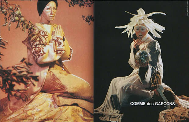
This 1994 collaboration with internationally acclaimed photographer, Cindy Sherman, and avant-garde Japanese fashion designer, Rei Kawakubo, still holds an edge over a lot of the more recent fashion photography campaigns. Sherman is best known for her self-portrait series Untitled Film Stills that feature a number of typified feminine characters. Sherman, inspired by Kawakubo's already pointedly unconventional fashion sense is driven to create a campaign equally unique. The coquettish personalities of her Film Stills are replaced by the slumped, unhappy and imperfect female persona. These photographs confront the consumer with a model that isn't particularly ideal at all; she floats in isolated contemplation, caught forever pensive in the frame of Sherman's photograph. Cindy Sherman would go on to a number of other fashion-related collaborations moving forward with names like Marc Jacobs and Balenciaga.
22. Tom Sachs x Nike
22. Tom Sachs
Label: NikeYear: 2012
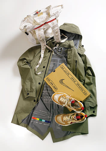
New York-based artist, Tom Sachs, introduced the world to his Space Program 2.0: MARS in May of 2012. Sachs' most recent Space Program incarnation was a fully embodied work. Fleets of workers inhabited the Park Avenue Armory space in New York City from May 16 to June 17. Men and women were dressed in full astronaut garb, and models of Mars Rovers, and extraterrestrial artifacts spanned the faux-NASA-headquarter space. In addition to living out a childhood fantasy of being an astronaut (especially without any chance of deep space death), Sachs took his collaborative creation a step further by having Nike join the league of forces propelling this dream of Space-on-Earth into reality. And thus NikeCRAFT was born, the line boasted original designs such as the "Mars Yard Shoe" and specially designed bags and outerwear for the collaboration. Product descriptions are littered with both clinical and far-out, playful language. One tote bag for sale by NikeCRAFT is described as "For everyday superheroes" and comes equipped with a thirty foot paracord, a grappling hooker, a pry bar and AAA batteries "(or drugs case)." Fanciful gestures like the latter butt up against scientific allusions to "JPL (Jet Propulsion Laboratory)," and "vectran fabric from the Mars Excursion Rover airbags," and at times fail to describe anything to most civilians, but are still quirky and fun.
21. Nick Knight and Gareth Pugh (Insensate)
21. Ruth Hogben and Nick Knight
Label: Gareth PughYear: 2008
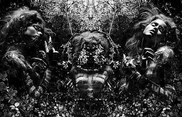
The team of directors, Ruth Hogben and Nick Knight, at SHOWStudio brought the world Gareth Pugh's 2008 and 2009 Autumn/Winter presentation. The team's film "Insensate" took on the indulgent darkness and kaleidoscopic opulence with a freedom of wandering aimlessness. The film is accompanied by a soundtrack by composer Matthew Stone, that can somehow be described as both ambient and thunderous. Myth has it that this short film, described as a "sinister but beautiful bloom," began with inspiration from Predator and The Wizard of Oz. And despite the hypnotic mirrored movements of the images on camera, model Abbey Lee—featured in the film— remains still for most of her time, moving only slightly as the titling implies (insensate – meaning to lack physical sensation). "Insensate" proved to be something of a Rorschach test for the fashion world, begging the question: "What is a fashion show? How are clothes meant to be shown?" And while some only saw meaningless inky blots of black and white, some saw a rather bright and glittering future.
20. Olaf Breuning x Bally
20. Olaf Breuning
Label: BallyYear: 2011 - 2012
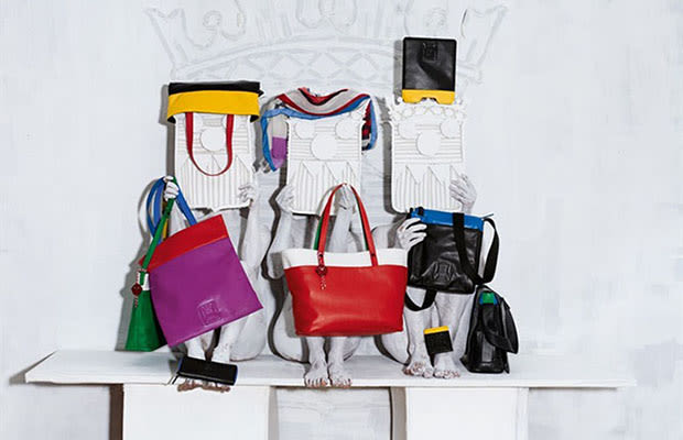
The Swiss artist, Olaf Breuning, is known for his—and his work's sense of humor. Breuning is also the second in an ongoing number of collaboration for the BallyLove series. The Bally—Breuning collaboration launched on November 30, in conjunction with the opening of Art Basel Miami Beach's 2011 festivities. The capsule collection designed along with Bally's Creative Directors Michael Herz and Graeme Fidler, features everything from women's rubber ballet slippers to men's loafers with neon lining, to a number of brightly colored satchels, and other accessories. The pop-up shop was available to the public in the Art Collectors Lounge of the fair. And alongside the originally-designed merchandise, are several still-life photographs (created and directed by Breuning) to re-imagine the late Andy Warhol's iconic Marilyn Monroe portraits. In an interview with Interview magazine, Breuning explained, "It seems so many great things are already done in the past, and as a contemporary artist, it is more and more difficult to be a pioneer. I always loved Andy's Marilyn's and...I want to honor them in my own language." Following the debut of the collection at Art Basel Miami Beach, the collection was available online from April 2012, then in select Bally flagship stores worldwide.
19. Francesco Vezzoli x Prada - 24 Hour Museum
19. Francesco Vezzoli
Label: PradaYear: 2012
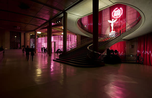
Why try to make an object to put in a museum, when you could make a museum of your own? Italian "super team," artist, Francesco Vezzoli, and fashion designer, Miuccia Prada, decided that perhaps an entire museum was too extreme, but maybe a 24-hour occupation of the Palais d'lena in Paris was enough. The museum opened on January 24, 2012 to much public excitement. The day was filled with student tours, press conferences and eventually, a celebratory dinner. The halls were lit by garish pink neon, and the galleries were filled with neo-classical sculptures and light-up busts of recognizable celebrities. Vezzoli and Prada are no strangers to sensationalism; Vezzoli has created faux film trailers with big names such as Roman Polanski, and commercials for non-existent designer products with the likes of Natalie Portman. A Huffington Post article about the 24 Hour Museum collaboration spoke of Vezzoli's ability to "create unabashed kitsch monsterpieces," which on first glance sounds harsh, but perhaps it is both Vezzoli and Prada's unique ability to create playful, seductive, kitschy and wholly-consuming commercial monsters that makes their collaboration all the more undeniably wonderful.
18. Anselm Reyle x Christian Dior
18. Anselm Reyle
Label: Christian DiorYear: 2012
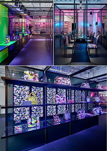
In the tradition of the designer Christian Dior, a professed art-lover and the founding father of the iconic fashion label, the brand sought out Berlin painter and sculptor, Anselm Reyle, in hopes of a collaboration for the 2012 Spring/Summer season. What came as a result were flats, wedges, clutches and classic Dior handbags emblazoned in metallic lambskin and ombré neon camouflage, that do anything but blend in. The jewelry wore the same boldness in cobalt and hot pink. The chunky leather and metal detailing of the jewelry created a quirky tension with the pearlescent baubles that hung between them. As the New York Times review of the collection put it: Reyle "didn't turn the house on its head so much as on its side." The article refers to Reyle's 45-degree tilt to the classic Dior quilting that is featured on a number of the totes and handbags in the limited-edition collection. The Reyle x Dior effort debuted at Dior's pop-up shop at Art Basel Miami on November 28 and remained open until mid-December. The collection was also released to six boutiques around the globe including Los Angeles, Tokyo, London and Paris, until the end of March.
17. Pringle of Scotland and Liam Gillick Pop-up Shop at Miami Basel
17. Liam Gillick
Label: Pringle of ScotlandYear: 2011
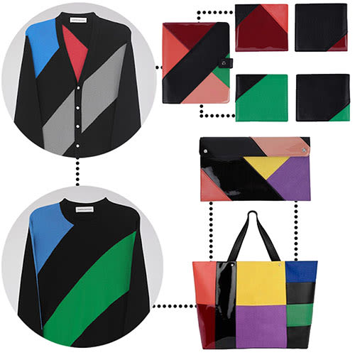
British artist, Liam Gillick, and Pringle of Scotland design director, Alistair Carr, came together and created an accessories and knitwear capsule collection aptly named 'liamgillickforpringleofscotland'. The collection's aesthetic inspiration began with Gillick's paintings; his tendency towards color blocking of bold and often unusual chromatic pairings rings clear throughout the line. As a part of a preview for the collaboration, Gillick also created runway benches for Pringle's women's show at London Fashion Week in September 2011. The benches were inscribed with text fragments from his then unpublished book titled Construction of One. Gillick described the collaboration with Carr as a game of "Ping-Pong"—as Gillick generated the color palette, Carr created the silhouettes. In a Dazed Digital interview regarding the collaboration, Gillick said, "I have always been interested in Pringle making wearable things that cross-over class structures." And when asked what exactly the fashion-collaboration qualified as, Gillick simply replied, "it is intended to operate as an integrated aspect of my work for Pringle—meaning that it is not entirely one thing or another."
16. David Lynch x Christian Louboutin
16. David Lynch
Label: Christian LouboutinYear: 2007
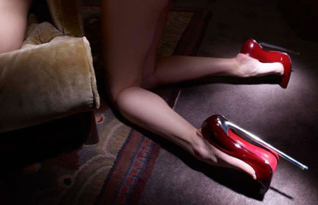
This 2007 collaboration between filmmaker, David Lynch, and French footwear designer, Christian Louboutin, produced photographs and artifacts expected of such an auspicious pairing. The designs produced by Louboutin go beyond footwear—most brink on complete dysfunction in terms of their walkability—and take on a more sculptural aura. The tallest heel among the bunch measures at 26 centimeters, but Louboutin's noted favorite in the collection was the pair of fused Siamese heels. But sculpture was not enough for Louboutin; "I find there's more emotion with cinematic images. I wanted Lynch' style...it was natural for me to ask him." The photographs directed and shot by Lynch reinforce the relic-like quality of the five pairs of shoes on display, and elicit the same dark theatrics of Lynch's filmic work.
15. Liu Bolin x Missoni, Valentino, Lanvin & Jean Paul Gaultier
15. Liu Bolin
Label: Missoni, Lanvin, Jean Paul Gaultier and ValentinoYear: 2012
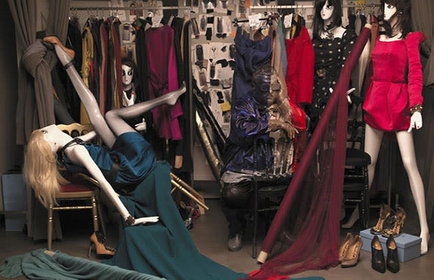
Liu Bolin may be painting every fashionista's favorite designer, but the origins of his art are by no means glamorous. Up until the demolition in 2005, Bolin worked in an artists' village in Beijing; he was forced to stand helpless as his studio was leveled by a decision of the Chinese government. In reaction, he created the work Hiding in the City, which showed—or obscured showing—Bolin in a series of portraits that begin at the rubble of the artists' village. In an interview with Harper's Bazaar he reminds readers, "It is very difficult for Chinese artists to earn their living; we are all martyrs of art." Although the initial intentions of his work are in the vein of protest, Bolin's latest works with fashion designers: Angela Missoni (of knitwear label Missoni), Jean Paul Gaultier, Alber Elbaz (of Lanvin) and Maria Grazia Chiuri and Pierpaolo Piccioli (of Valentino), take on a more lighthearted tone. In the same Harper's Bazaar article Bolin explains that it takes hours to stage one photograph and innumerable additional hours to paint the subject into place—sometimes allegedly up to five days. In a gesture of bridging Chinese culture's infatuation with 'Western brands' he "hid each designer in his or her own designs. You think about the relationship between the world we create and ourselves."
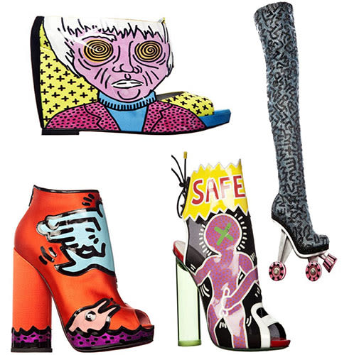
14. Keith Haring x Nicholas Kirkwood
14. Keith Haring
Label: Nicholas KirkwoodYear: 2011
For men, women and everyone in between there are shoes—and then there are "shoes." The latter is capped in quotation marks to imply that all footwear is (and was) not created equal. And footwear designer Nicholas Kirkwood is on-trend with high quality shoes as usual; this time with his collaboration with the Keith Haring Foundation. While the collection was only available exclusive to the Joyce boutique in Hong Kong, the full collection was released at Mr. Kirkwood's newly opened retail space on Mount Street in London beginning in July of 2011. Kirkwood has used Haring's classics like Safe Sex and Radiant Baby in a bold and playful way that not only points to Haring's genius as a legible illustrator but also to Kirkwood's clever and elegant appropriation of Haring's imagery.
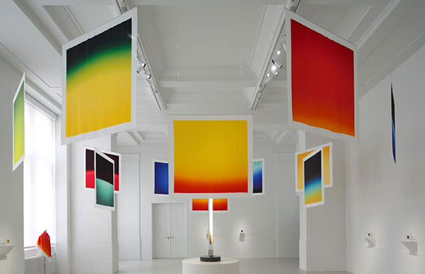
13. Josef Albers, Daniel Buren and Hiroshi Sugimoto x Hermes
13. Josef Albers, Daniel Buren, and Hiroshi Sugimoto
Label: HermesYear: 2012
Some people can't have too many scarves, and if the brand Hermès was a person, they would be one of them. The company continues in its tradition of seeking out the most innovative prints for the iconic Hermès scarf by extending invitations to contemporary artists to collaborate in their creation. The continuing collaborative project is called Hermès Editeur, and consists (thus far) of three collaborations: German artist, Josef Albers, French artist, Daniel Buren and Japanese photographer, Hiroshi Sugimoto. The (extremely) limited edition scarves range from ones resembling Albers' most well known square-shaped studies of color, to Sugimoto's polaroids of prismatically reflected and diffracted light, and 365 originally designed scarves by Buren—one for each day of the year.
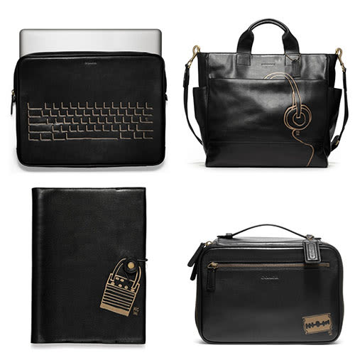
12. Hugo Guinness x Coach
12. Hugo Guiness
Label: CoachYear: 2012
Leather goods brand, Coach, has a knack for picking artist-collaborators. Continuing their trendy trajectory, they tapped New York-based printmaker and illustrator, Hugo Guinness, to design a line of limited edition leather totes, laptop cases, wallets and other satchels embossed with his simple and charming illustrations. There are few critiques, and seeing as any of the Coach x Guinness merchandise would instantly up the fashion quotient for any man, woman or child, others probably don't have any either.
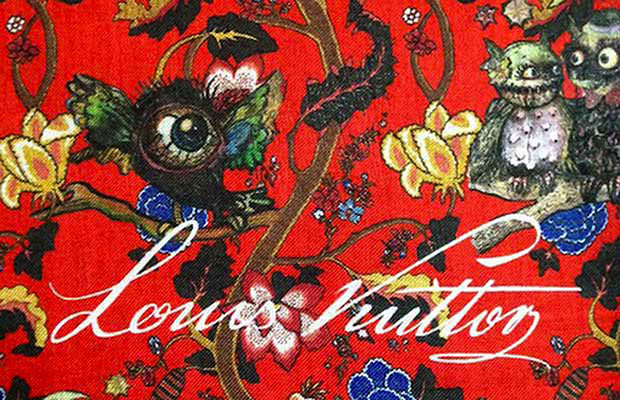
11. Dinos and Jake Chapman x Louis Vuitton
11. Dinos and Jake Chapman
Label: Louis VuittonYear: 2013
The handsomely utilitarian Autumn/Winter 2013 menswear collection for Louis Vuitton was designed by Kim Jones. Jones' inspiration led him to the Himalayas for research, and he came back with a particular affection for the mysterious Kingdom of Bhutan. It is from Jones' sights and travels that the snow leopard and the tigers paths, both in the mountains of the Himalayas as well as the collection. Jones went out on another limb and commissioned the notorious Anglo-Greek Chapman Brothers (Jake and Dinos) to design a print for the collection—one fittingly based on the 'Garden in Hell.' In an interview Jones' said "This was the phrase Diana Vreeland famously used to describe her apartment. It was something we both responded to, that and all of the unusual animals to be found in the Himalayas." Their illustrious print was the Chapman Brothers' take on the French baroque floral print, and features "surprising elements to the creeping floral design" like hybridized creatures like oversized bloodshot eyeballs, feathered with bird's feet, strange looking owls and mélange of offbeat blossoms. The textile made its debut (in red and blue, respectively) in the eveningwear portion of the show, first as a blazer, then as a coat, pants, and bag, then culminating in a head-to-toe print finale.
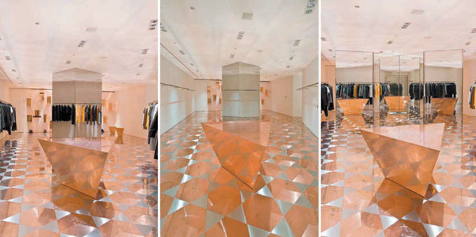
10. Roger Hiorns x Raf Simons
10. Roger Hiorns
Label: Raf SimonsYear: 2008
In 2008, the Belgian fashion designer, Raf Simons, invited British artist, Roger Hiorns, to alter the interior of his retail space in Osaka, Japan. After its transformation the view was simultaneously confusing and breathtaking. The floors glimmered with the warmth of copper and the walls disappeared into multi-faceted reflections of Simons' chic menswear offerings. Simons invited Los Angeles-based artist, Sterling Ruby, and Hiorns to take over his respective flagship boutiques in Tokyo (for Ruby), and in Osaka (for Hiorns) in the same year. The Tokyo interior is at times chaotic, each square inch of space firmly rooted and almost leading to the next. The Osaka interior seems to dissolve into itself; the floors into the walls, the walls into themselves, and eventually the customer into the space spiraling into what Hiorns calls "the consumer's search for self-affirmation." Although Hiorns speaks of 'self-affirmation' it feels like all of the dizzying reflections might make a consumer more self-conscious—so, hopefully the lighting is flattering. Regardless of flattery or not—the space is beautiful, and quite the foil to Simon's Tokyo counterpart.
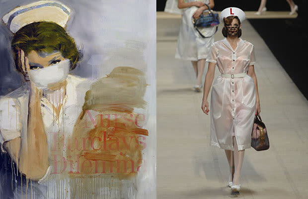
9. Richard Prince x Louis Vuitton
9. Richard Prince
Label: Louis VuittonYear: 2008
In 2007, Marc Jacobs approached American artist, Richard Prince, and asked him if he was interested in collaboration for one of Louis Vuitton's upcoming collections. As Jacobs recalls, Richard Prince "asked me, what about Louis Vuitton after dark?" From that question something crazy and beautiful was born. Their collaboration proved fruitful: the collections (from clothing to accessories) were well received, and Prince's nurse paintings came to life on Paris' runway and beyond. Vuitton's accessory line seemed to expand exponentially with all the iterations of Prince-inspired merchandise. Prince's Joke painting texts made their way to side panels of hand bags with snakeskin handles; the infamous Vuitton monogram was scaled up and down, woven into denim, embroidered onto multicolored fabric, and printed on vinyl in humming pinks and teals. The shoes and jewelry felt haphazard and glamorous—almost like Jacobs and Prince made something from all the leftovers, but something enviable and still oozing with confidence.
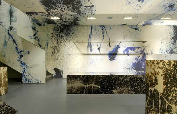
8. Raf Simons x Sterling Ruby
8. Sterling Ruby
Label: Raf SimonsYear: 2008 - 2009
The internationally acclaimed Belgian fashion designer, Raf Simons, invited German-born, Los Angeles-based artist, Sterling Ruby, in 2008 to use his "Tokyo boutique as a canvas." Sterling's intervention transformed the store's interior from a clinical white space into something that in some ways is hard to describe. The walls were left white by Ruby, and in his typical style, appears to have haphazardly thrown paint everywhere and ended up with something beautiful, simultaneously minimal, and chaotically expressive. The plinths used to display the clothing are black with bleach splashed across them (a technique favored by Ruby in his textile manipulation work), which creates a seductive and unifying tension between the architecture holding the clothes, and the greater structure holding the entirety of the shop. The slight tonal varieties and organic veins of color converts what appears to be drywall into a material more akin to marble in a gesture of a sort of beguiling decadence. The collaboration between the two creatives was so copacetic that Simons brought on Ruby to create a unique capsule collection following the same aesthetic theme of Tokyo boutique installation the following year. Simons and Ruby have continued their collaborative relationship as recently as 2012, when Simons created fabric with images of four of Ruby's recent works. The textiles debuted as a part of Simon's premiere haute couture collection with design house Christian Dior.
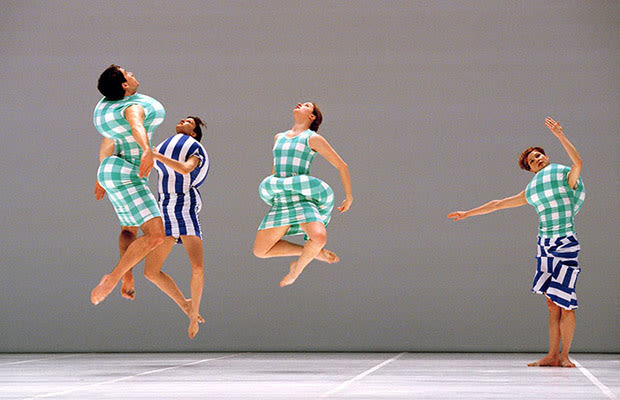
7. Merce Cunningham x Rei Kawakubo
7. Merce Cunningham
Label: Comme des GarconsYear: 1997
Rei Kawakubo first started designing under the name Comme des Garçons in 1969, and since then she has been making her name known as one of the foremost avant-garde fashion designers in the world. Merce Cunningham was making himself known under similar terms, but within the dance context. Kawakubo had always "shared similar creative philosophies with Merce Cunningham, including interests in engaging multiple artistic disciplines and aggressively pushing the boundaries of the unknown." After Cunningham's initial offer to give her complete freedom in designing the costumes and the set, Kawakubo declined. As myth has it, while working on her notorious spring collection of 1997, titled "Body Meets Dress, Dress Meets Body," she changed her mind. The collection was an aggressive response to her feelings of boredom with fashion. She padded the dresses in a way to reshape the body under new circumstances—her own circumstances. Similarly to the "Body Meets Dress" collection, the costumes Kawakubo designed for her collaborative work with Cunningham (tilted Scenario) featured the same "irregular bulges on the dancers' hips, shoulders, chests, and backs." Wearing these costumes altered the dancers' proportions, their balance, sense of space, and even their fundamental extent of movement. This experimental collaboration between Cunningham and Kawakubo transcends boundaries of art, fashion, costumes design, set design, dance and performance; their partnership should stand to remind us that there really isn't that much of a difference between those categories at all.
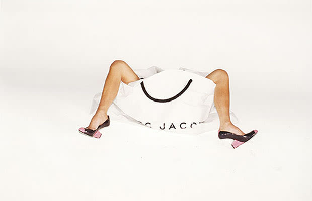
6. Juergen Teller x Marc Jacobs
6. Juergen Teller
Label: Marc JacobsYear: 1998 - Present
It all began in 1998, and many of us can't even remember what Marc Jacobs (the brand) looked like before Juergen Teller. Teller's overexposed and slightly rosy tint make his photographs feel more like adventurous polaroids between friends than esoteric fashion photography. His imagery is playful but always with a little tinge of deflation, grunge or raunchiness—like Jacobs' clothing. Since the auspicious beginnings of the Teller-Jacobs collaboration in 1998, Marc Jacobs' ads have become a celebrity fashion yearbook with notable subjects like Winona Ryder, Sofia Coppola, Helen Bonham Cater, Dakota Fanning and photographer Cindy Sherman.
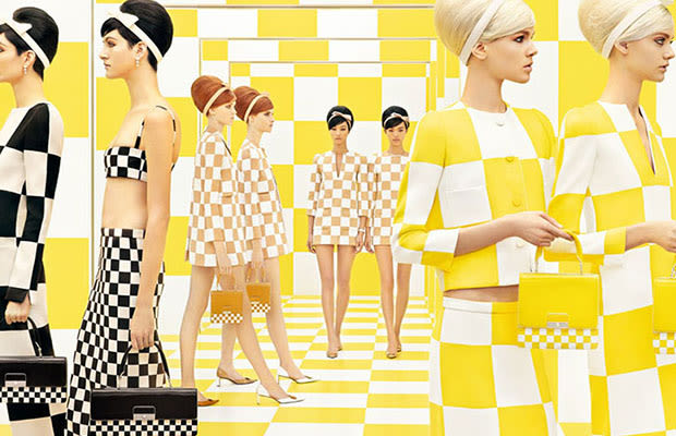
5. Daniel Buren x Louis Vuitton
5. Daniel Buren
Label: Louis VuittonYear: 2012
2012 brought the collaboration between the legendary French artist, Daniel Buren (known for his striped posters and conceptual art work), and the legendary fashion house, Louis Vuitton (with Marc Jacobs serving as the creative head). Jacobs sought out Buren to offer his collaboration in the coming season and to extend gratitude for Buren's installation of the controversial work Les Deux Plateux; a work that served as a point of great inspiration for Jacobs and the Spring/Summer collection. Buren created the extravagant set of the highly anticipated Louis Vuitton runway show as a site-specific installation. Everything from the escalators to the immaculate yellow and white checked floor was a result of Buren's design and Jacobs' enabling. The work of Buren seemed to fit in seamlessly with Jacobs' collection for Louis Vuitton; stripes and the grid were frequent motifs in Buren's work, but also within the graphic culture of Louis Vuitton (as in the Damier check). Apparently the co-mingling of these two creative powers was so invigorating that Buren lent his time and talents to working on the advertising campaign and storefronts for Louis Vuitton after the close of the show. In a December 2012 interview with Vogue, Buren said of Jacobs' work: "And I must say I found it very, very beautiful, very strict, very strongly architectural."
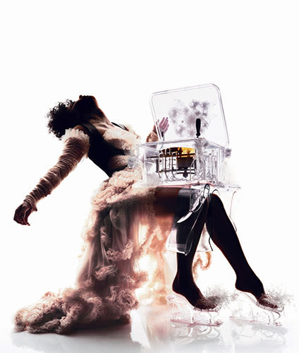
4. Björk x Alexander McQueen
4. Björk
Label: Alexander McQueenYear: 1997 - 2010
This epic relationship began when Icelandic native Björk released her fourth record, Homogenic in 1997 – and the image that held the album cover got nearly as much press as the music. The "elfin chanteuse" her fans had come to love had transformed into a different almost unrecognizable creature; a creature that, today we know was borne from her collaborative conversations with then, 26-year old Alexander McQueen. "When I went to Alexander McQueen, I explained to him the person who wrote these songs—someone who was put into an impossible situation, so impossible that she had to become a warrior...a warrior who had to fight not with weapons but with love." The respective work of these two creative geniuses seemed to discuss similar themes of man, nature and machine. The two went on to collaborate several times: McQueen directed Björk's video for "Alarm Call," and in 2003, the pair reunited for a Fashion Rocks! performance, where she sported a McQueen gown and crystal mask for the finale of her performance. McQueen was also responsible for Björk's fantastical bell-covered dress worn in the 2004 video "Who Is It?" And in a 2003 conversation between Björk and McQueen with Index magazine, he said of his own designs that sound like it could have come from either virtuoso, "my work is always in some way directed by nature. It needs to connect with the earth. Things that are processed and reprocessed lose their substance."
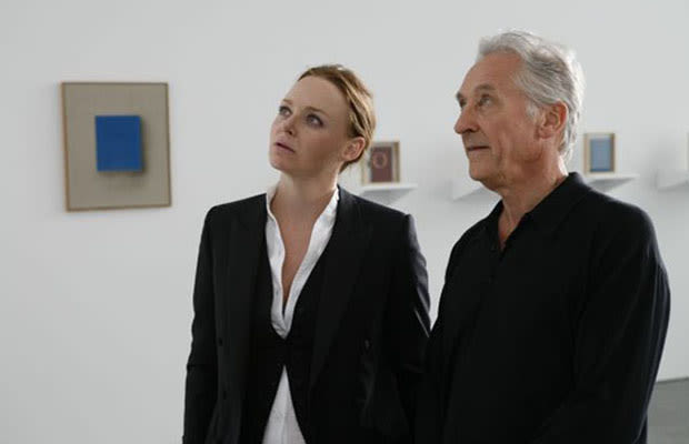
3. Ed Ruscha x Stella McCartney
3. Ed Ruscha
Label: Stella McCartneyYear: Hopefully 2013
Successful fashion designer, Stella McCartney, and legendary artist, Ed Ruscha, participated in a recorded conversation for the Sundance Channel program "Iconoclasts" and pitched each other ideas for a potential collaboration. So, this entry is here because perhaps if we all wish hard enough, this seductive and timely pairing will materialize sooner.
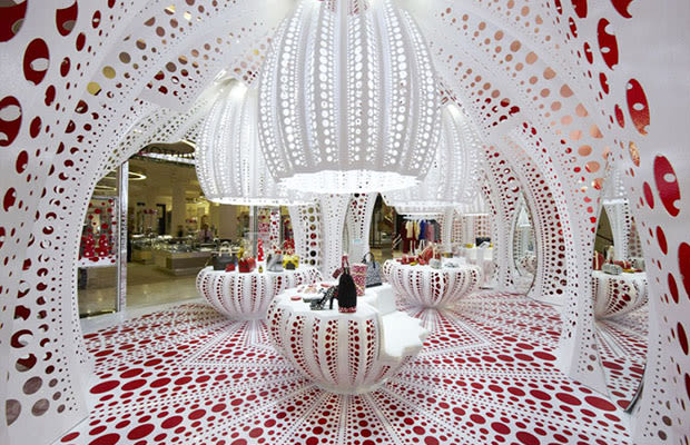
2. Yayoi Kusama x Louis Vuitton
2. Yayoi Kusama
Label: Louis VuittonYear: 2012
2012 was a good year for Japanese artist Yayoi Kusama. She is best known for her use of polka dots, and a retrospective exhibition of her artwork was shown at two major international museums over the course of one year. If you don't recognize her name, you may have seen the dotted flower sculpture of Beverly Hills or the Yellow Trees that enveloped the Whitney Museum development in the Meatpacking District of Manhattan. Kusama told Women's Wear Daily, "Marc Jacobs came to see me in Tokyo in 2006, and he asked me if I wanted to come to the States and do fashion. That sort of encouraged me because...Fashion has always attracted me." From this 2006 encounter, blossomed a series of garments, window fronts and shop designs that—thanks to Jacobs' collaboration—made Kusama's artistic visions come alive across the globe. Unfortunately, the clothes paled in comparison to the graphic and hypnotic storefronts. Most notable was London's Selfridge department store that featured Kusama's favored giant pumpkins—and subsequently, a completely sold out collection. Printemps in Paris donned mirrored window fronts with polka dotted mannequins and silver baubles reminiscent of Kusama's 1966 Narcissus Garden work.
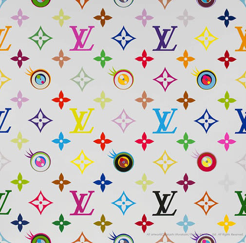
1. Takashi Murakami x Louis Vuitton x MOCA Los Angeles
1. Takashi Murakami
Label: Louis VuittonYear: 2007
Amidst the millions of anime eyes and smiling flowers of Tokyo-born pop-artist Takashi Murakami's 2007 exhibition "Superflat," was the world's most indulgent museum shop. Monographs, posters, and key chains were reserved for MOCA's actual in-house store, a Louis Vuitton pop-up establishment with thousand-dollar totes. The monogrammed merchandise featured familiar characters and motifs of Murakami's and was specially designed for the in-situ boutique. The gesture was an unprecedented one for any American art museum, and in an interview at the opening of the exhibition, supermodel Linda Evangelista was asked by a reporter, "What do you think of this synergy of art and fashion?" Her response, "Well, it certainly makes fashion more interesting." The collaboration that began in 2003 as multicolored L's and V's had evolved into so much more. The cultural titans of 'high art' and 'high fashion' collided, and found their clash to be mutually beneficial; although it seems that there has yet to be as confident a move since.
No comments:
Post a Comment